About Sermon Widgets
The Sermon Widgets help you add dynamic sermons to your pages via the Ekklesia 360 Ministry Content Plugin.
Sermon Layout Widget
This is a filterable archive of all available sermons from Ekklesia 360. Using the settings of the module, you can choose categories and groups as well as how many per page should be displayed. You can also choose parts of the sermon to display, offering different amounts of information.
Content Tab
Layout Settings
Toggles to format the content displayed for the sermon layout.
- Column Count: Set how many columns will be displayed, from 1 to 6
- Show Pagination
- Show Inline Video: If this is selected and you would like the image to be a fallback when no video is available make sure to select "Show Images".
- Show Inline Audio
- Show Media Links: Each Article can have 1 image, 1 video, 1 audio file, and 1 document associated with it.
- Show Title
- Show Date
- Show Category
- Show Group
- Show Series
- Show Preacher
- Show Passage
- Show Meta Headings
- Show Preview
- Open in Full Screen: The video/audio popup to be a full-screen.
- Sticky Header Spacing: This pixel setting is used when your site has a sticky header or navigation to allow a spacing from the sticky element from overlapping the filters when scrolling.
Filter Settings
- Show Group Filter
- Group Filter Heading
- Show Category Filter
- Category Filter Heading
- Show Series Filter
- Series Filter Heading
- Show Speaker Filter
- Speaker Filter Heading
- Show Search
- Search Placeholder
- Count Per Page
Detail Options
- Detail Button Text: Button will display if text is entered and a detail page selected.
- Sermon Detail Page: URL of sermon detail page. If used will add a link to the heading to take the user to the sermon detail page. Requires the "Sermon Detail" widget to be placed on a page and that page url/slug placed in this field.
Style Tab
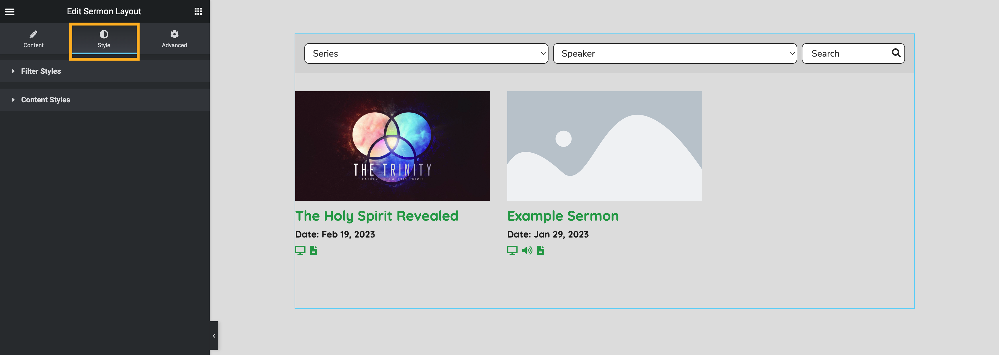
Use the following options to style your Sermon Layout Widget.
Filter Styles
- Filter Background
- Input Background
- Input Border Color
- Input Border Radius
- Input Color
- Input Typography
Content Styles
- Title Color
- Title Typography
- Meta Color
-
Meta Typography
- Media Typography
- Preview Typography
- Preview Color
- Link Color
- Link Color Hover
- Alignment
- Button Alignment
- Element Spacing
- Media Border Radius
Advanced Tab
Learn more about this tab in the Elementor Academy: Advanced Tab.
Updated