About Event Widgets
The Event Widgets help you add dynamic events to your pages via the Ekklesia 360 Ministry Content Plugin.
Event Layout Widget
This is a filterable archive of all available events from Ekklesia 360. There are three tabbed views for your Event Layout, Featured, List and Calendar. Using the settings of the module, you can choose categories and groups as well as how many per page should be displayed. You can also choose parts of the event to display, offering different amounts of information.
NOTE about Event Layout Views: When editing the Event Layout Widget, all tabbed content will appear stacked to allow you to see what you are editing.
The published page content will be separated by your chosen views.
Featured Events View
Event List View
Event Calendar View
Content Tab
Layout Settings
Toggles to format the content displayed for the event layout.
- Show Featured View
- Featured View Order: The featured view default is the first position. If you change the order make sure the other view positions are updated to be unique.
- Featured View Heading
- Howmany Featured
- Featured Column Count: Set how many columns will be displayed, from 1 to 6
- Show Featured Images
- Show Featured Preview
- Show Featured Title
- Show Featured Date
- Show List View
- List View Order: The list view default is the second position. If you change the order make sure the other view positions are updated to be unique.
- List View Heading
- Show Calendar View
- Calendar View Order: The calendar view default is the third position. If you change the order make sure the other view positions are updated to be unique.
- Number of Months
- Sticky Header Spacing: This pixel setting is used when your site has a sticky header or navigation to allow a spacing from the sticky element from overlapping the filters when scrolling.
Filter Settings
- Parent Category: Defines which level 1 category to use as a base for the layout.
- Show Category Filter
- Category Filter Parent: Defines which level 2 category for this specific filter. If selected will show the next level of categories as select options. If a Parent Category is selected above make sure to select a child category of that parent.
- Category Filter List: This should be a comma separate list of category slugs without spaces eg. if you wanted to use the categories "Category Example 1" and "Category Example 2" the list would be "category-example-1,category-example-2". This option removes the parent filter options.
- Category Filter Heading
- Add Category Filter: Toggle to include more filter dropdown options and select the category and heading. A total of 4 Category filters can be defined.
- Add Category Filter Parent: Additional category filters require this selection. Defines which level 2 category for this specific filter. If selected will show the next level of categories as select options. If a Parent Category is selected above make sure to select a child category of that parent.
- Show Group Filter
- Group Filter Heading
- Show Search
- Search Placeholder
Detail Options
- Event Detail Page: URL of event detail page. If used will add a link to the calendar titles to take the user to the event detail page. Requires the "Event Detail" widget to be placed on a page and that page url/slug placed in this field.
Style Tab
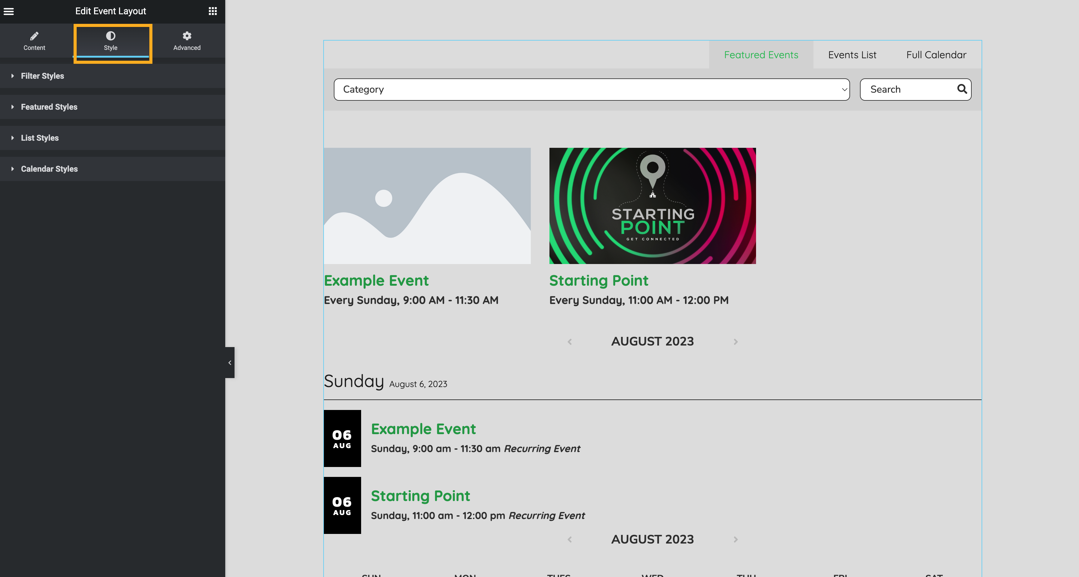
Use the following options to style your Event Layout Widget.
Filter Styles
- View Color
- View Hover Color
- View Background Color
- View Active Color
- View Active Background Color
- View Typography
- Filter Background
- Input Background
- Input Border Color
- Input Border Radius
- Input Color
- Input Typography
- Pagination Heading Color
Featured Styles
- Title Color
- Title Typography
- Date Color
-
Date Typography
- Preview Color
- Preview Typography
- Link Color
- Link Color Hover
- Alignment
- Button Alignment
- Element Spacing
- Image Border Radius
List Styles
- Day Grouping Color
- Day Grouping Border
- Day Grouping Typography
- Date Coolor
- Date Background
- Date Typography
- Title Color
- Title Typography
- Meta Color
- Meta Typography
- Link Color
Calendar Styles
- Calendar Border
- Day Color
- Day Background
- Event Text Color
- Link Color
Advanced Tab
Learn more about this tab in the Elementor Academy: Advanced Tab.
Updated